Brand Board — single sheet
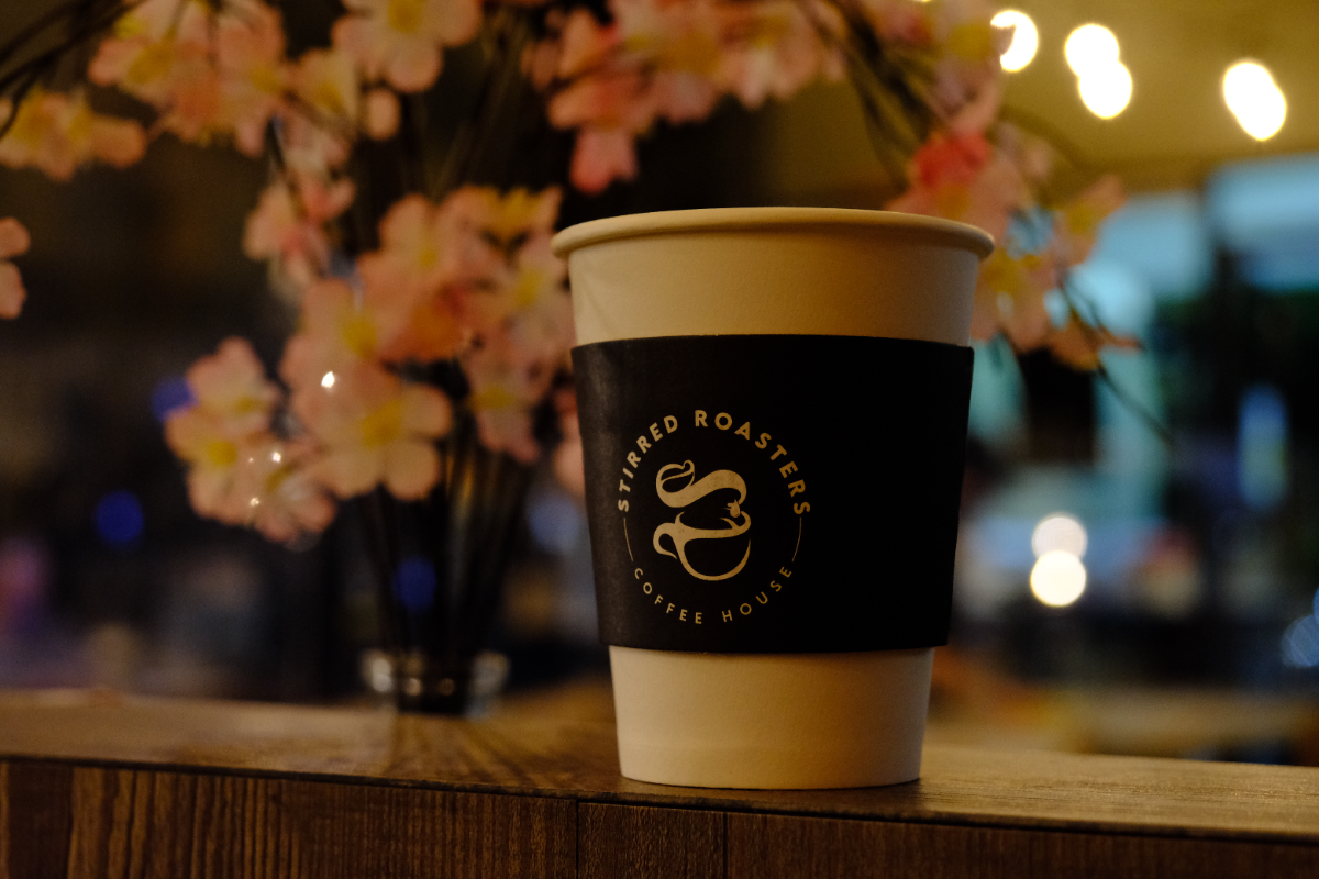
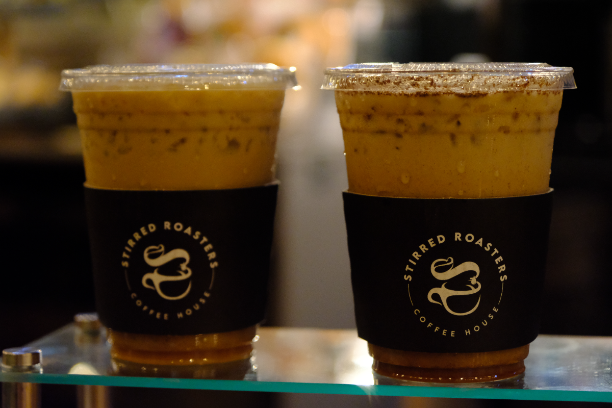
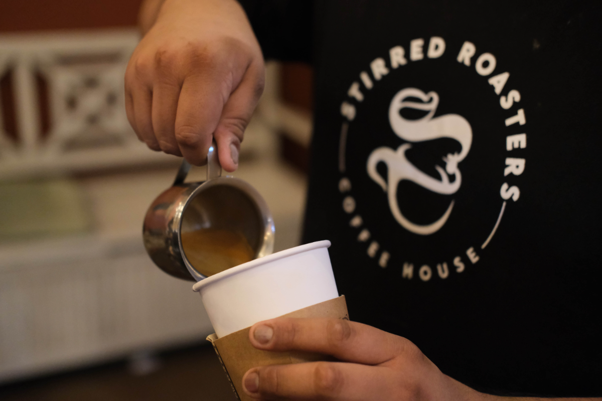
A coffee house identity that reads in low light — gold on charcoal, one monogram, and a menu board you can take in from the door.
Owner — Stirred Roasters Coffee House, Cerritos CA.
Mark — the interlocking S: two cups, one bean.
Face — geometric caps, wide tracking. Brush script for menu headers only.
Voice — warm, short, never precious about coffee.
Mark — the interlocking S: two cups, one bean.
Face — geometric caps, wide tracking. Brush script for menu headers only.
Voice — warm, short, never precious about coffee.
Colour
Roast
#2B2724 · ground of everything
Signal gold
#E9A81C · headers, prices, CTAs
Foil
#C4952F · print & embroidery only
Cream
#F4EBDA · body copy on dark
Kraft
#B98B5E · sleeves, bags, tape
Target proportion on a typical surface — roast 66 · cream 20 · gold 9 · kraft 5.
Type
STIRRED
Over Ice
ICED CARAMEL LATTE $6.00
Three roles only — geometric caps for the brand, brush script for menu headers, chalk caps for menu items and prices.
In the wild
Menu boards
Brand Guide — page 1 / 17
Stirred Roasters Coffee HouseBrand & Style Guide
Cerritos, California · Vol. 01
STIRRED
ROASTERS
COFFEE HOUSE
ROASTERS
COFFEE HOUSE
Everything the brand is made of — the monogram, the charcoal-and-gold palette, the chalk menu boards, the cups, the uniform and the way we talk to people at the register.
stirredroasters.com
Vol. 0101
Brand Guide — page 2 / 17
ContentsBrand & Style Guide
What is in this guide
Seventeen sheets, in the order you will need them.
Read pages 4 to 9 before making anything. Everything after that is application — boards, cups, uniform, cards, photography, voice.
If you only read one page
Page 17. It is the whole system on one sheet — hex values, type roles, and the four things never to do.
03Positioning — who we are
11Iced & blended boards
04The monogram
12Cups & sleeves
05Lockups & clear space
13Uniform
06Logo misuse
14Cards & stationery
07Core palette
15Photography
08Proportion & contrast
16Voice
09Typography
17Quick reference
10Menu boards
Contents02
Brand Guide — page 3 / 17
PositioningBrand & Style Guide
Who we are
A neighbourhood coffee house that behaves like a roaster.
Stirred Roasters sits on South Street in Cerritos. Regulars come for the same drink at the same hour, and for the fifty flavours behind the counter that let them change their mind. The brand has to do two jobs at once: feel like a specific place, and make a wall of ninety drinks easy to order from.
We are
Warm. Fast. Legible in the dark. Generous with options.
We are not
A minimal third-wave bar. No lectures about origin or extraction.
The test
Could a first-timer order confidently from the door, at night?
The line we design to
Open early. Stirred to order. Ninety ways to have it your way.
Positioning03
Brand Guide — page 4 / 17
IdentityThe monogram
The mark
Two cups and a bean, drawn as one S.
The monogram is a single continuous stroke: the upper bowl reads as a cup with a bean inside, the lower bowl as a saucered cup, and the whole thing resolves into an S for Stirred. It only ever appears as one flat colour — gold, cream, or black.
Primary
Gold monogram on roast. Cups, shirts, signage, cards.
Reverse
Cream monogram on roast. Aprons, embroidery, small sizes.
Circle seal
Monogram inside the ring, STIRRED ROASTERS above, COFFEE HOUSE below.
Minimum
Seal 22 mm across. Below that, use the bare monogram.
Identity04
Brand Guide — page 5 / 17



IdentityLockups & clear space
Four lockups, one hierarchy
STIRRED
ROASTERS
ROASTERS
COFFEE HOUSE
Stacked wordmark
Cards, signage, print headers. The default when there is room.
Circle seal
Cups, sleeves, caps, stickers. Anything round or small.
Bare monogram
Embroidery, favicon, stamp, cup lid. Under 22 mm.
STIRRED
Sign lockup
Exterior signage and awnings only. Monogram left, STIRRED right, illuminated white — read from the parking lot, so the descriptor drops.
Clear space
Keep clear space equal to the height of the monogram's bowl on all four sides — roughly one third of the mark's total height. Nothing enters it: no text, no price, no photo edge, no cup seam.
The dashed edge is the minimum bounding box. On a 40 mm seal that margin is 13 mm. On the sign it is the dark band above and below the letters. When in doubt, give it more.
Identity05
Brand Guide — page 6 / 17
IdentityMisuse
Do not
Six ways the mark comes apart.
The monogram is a single stroke drawn at one weight. Anything that changes that weight — recolouring, shadows, stretching, gradients other than the flat foil — breaks it at the sizes we actually print.
One exception
Printed foil and embroidery may carry the gold's natural texture. That is the material, not an effect added in software.
Identity06
Brand Guide — page 7 / 17
ColourCore palette
Five values, no more
Roast
#2B2724
R43 G39 B36
C64 M63 Y66 K61
Pantone Black 7 C
R43 G39 B36
C64 M63 Y66 K61
Pantone Black 7 C
The ground. Menu boards, cups, shirts, cards, signage.
Signal gold
#E9A81C
R233 G168 B28
C7 M36 Y100 K0
Pantone 1235 C
R233 G168 B28
C7 M36 Y100 K0
Pantone 1235 C
Menu headers, prices, size totals, one CTA per surface.
Foil
#C4952F
R196 G149 B47
Metallic gold stock
Pantone 872 C
R196 G149 B47
Metallic gold stock
Pantone 872 C
Print and embroidery only. Never a screen colour.
Cream
#F4EBDA
R244 G235 B218
C4 M6 Y15 K0
Pantone 7527 C
R244 G235 B218
C4 M6 Y15 K0
Pantone 7527 C
Body copy and item names on roast. Cup bodies.
Kraft
#B98B5E
R185 G139 B94
Uncoated kraft stock
Pantone 729 C
R185 G139 B94
Uncoated kraft stock
Pantone 729 C
Sleeves, bags, tape, napkins. A material, not an accent.
Colour07
Brand Guide — page 8 / 17
ColourProportion & contrast
How much of each
Roast 66 · cream 20 · gold 9 · kraft 5. Gold never carries more than a tenth of a surface — it is the thing your eye lands on first, and it stops working if there is a lot of it.
Contrast pairs
Cream on roast
13.1:1 — body copy, item names, any size.
Gold on roast
7.4:1 — headers, prices, all sizes.
Roast on gold
7.4:1 — badges, stickers, buttons.
Roast on cream
11.6:1 — print, receipts, paper menus.
Never
Cream on gold
1.8:1 — illegible at every size.
Gold on kraft
1.4:1 — the two browns cancel.
On photography
Colour08
Brand Guide — page 9 / 17
TypographyThree roles
Brand — geometric caps
STIRRED
ROASTERS
ROASTERS
Jost, Medium & Semibold.
Tracking +100 on the name, +340 on COFFEE HOUSE.
Caps only. Never set body copy in it.
Tracking +100 on the name, +340 on COFFEE HOUSE.
Caps only. Never set body copy in it.
Menu headers — brush script
Over Ice
Specialty
Specialty
One weight, gold, always sentence case.
Headers and category names only — never a price, never a paragraph, never more than three words.
Headers and category names only — never a price, never a paragraph, never more than three words.
Menu items — chalk caps
ICED MOCHA LATTE
$6.00 · $6.80 · $7.70
$6.00 · $6.80 · $7.70
Every drink name, size header and price.
Cream for names, gold for the size totals under a specialty box.
Cream for names, gold for the size totals under a specialty box.
Scale in use
Board headerScript 190px on a 1080-tall board · gold
CategoryScript 96px · gold
Size rowChalk 60px · cream, 60% opacity
Drink nameChalk 60px · cream
PriceChalk 60px · cream, tabular columns
Specialty totalChalk 56px · gold
Legal lineChalk 26px · cream, 70% opacity
Do
Let the script carry the mood and the chalk carry the information. One script header per board.
Do not
Set drink names in script, mix the script with the wordmark, or add a fourth typeface for promos — use gold instead.
Typography09
Brand Guide — page 10 / 17
ApplicationMenu boards
The grid behind every board
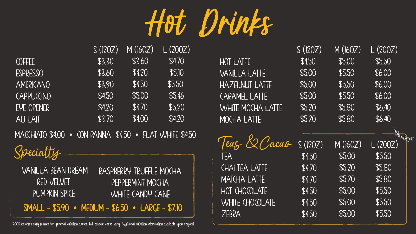
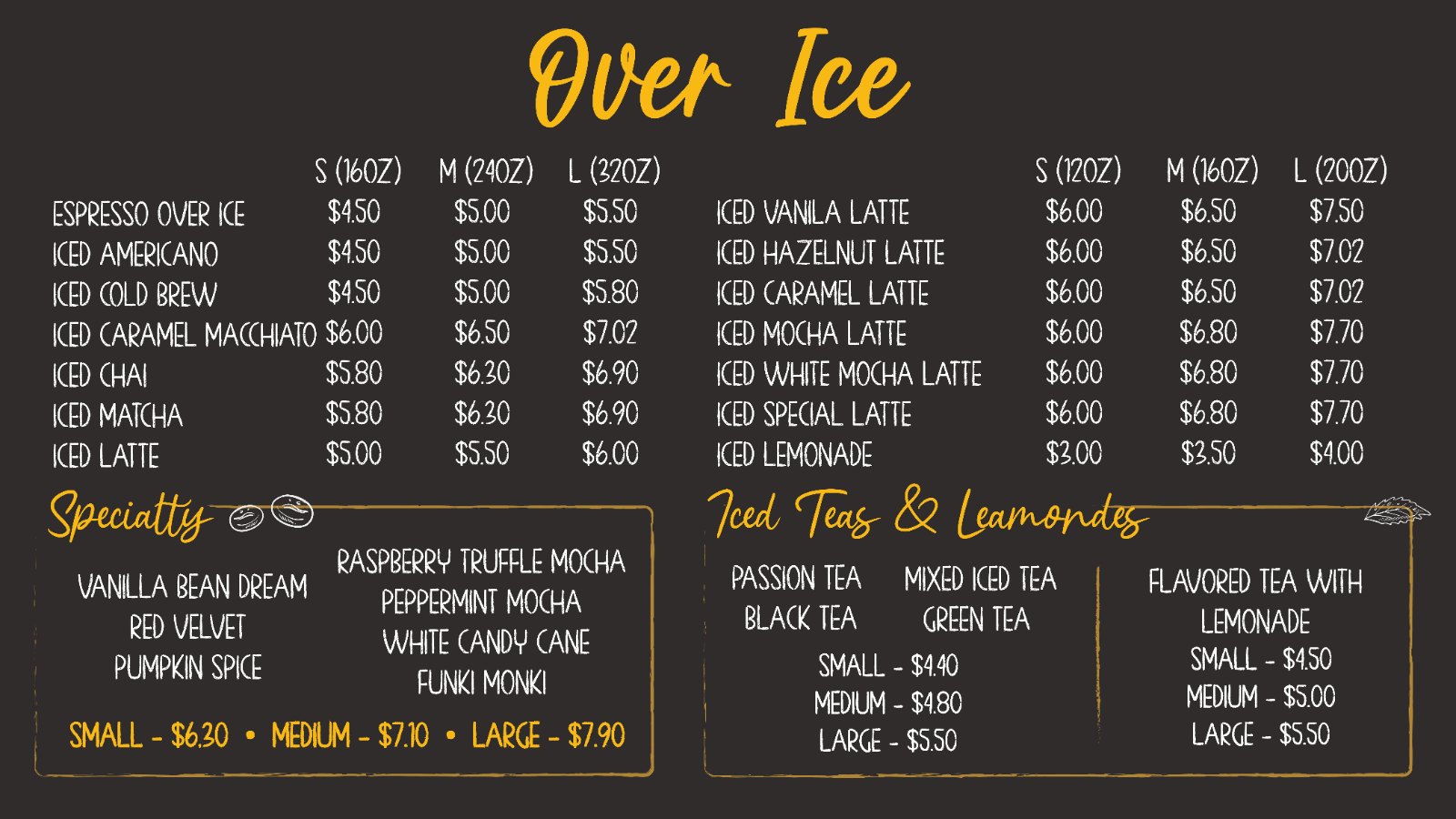
Each board is 16:9, roast ground, split into two columns with an eight-column price gutter on the right of each. The script header sits centred at the top and is the only thing allowed above the columns.
01Script header, centred, gold. One per board.
02Size row — S / M / L with ounces in brackets. Repeated per column.
03Drink list, chalk caps, cream, left aligned, prices right aligned.
04Specialty and Teas boxes — hand-drawn gold rule, category in script.
05Flat pricing line in gold under a box, dot-separated.
06Legal line, bottom left, smallest type on the board.
Please note
These boards were designed in 2021. Prices, drink names and the board layout itself have likely changed since — read these sheets as a record of the system, not as the current menu.
Fixing the current set
Three typos ship today: “Specialtty”, “Leamondes”, “Iced Vanila”, and a doubled “$$7.60”. Correct these before any reprint — the boards are the most-read surface the brand has.
Application10
Brand Guide — page 11 / 17
ApplicationIced & blended boards
Please note
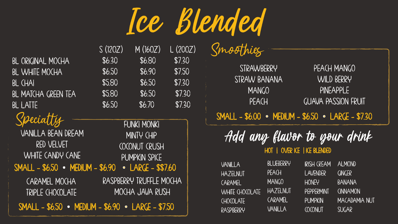
Designed 2021. Prices and items shown are almost certainly out of date — the system is the deliverable, not these numbers.
Order on the wall
Hot, Over Ice, Ice Blended, left to right. The queue reads left to right; the menu has to match.
Sizes differ
Over-ice espresso runs 16/24/32 oz; everything else 12/16/20. Always print the ounces — never S/M/L alone.
Seasonal items
Pumpkin Spice, Peppermint Mocha and White Candy Cane live inside the Specialty box, not in the main columns.
The flavour wall
Twenty-four syrups set in four columns, chalk caps, no prices — the header carries HOT | OVER ICE | ICE BLENDED in gold.
Application11
Brand Guide — page 12 / 17
ApplicationCups & sleeves
Hot — white cup, roast sleeve
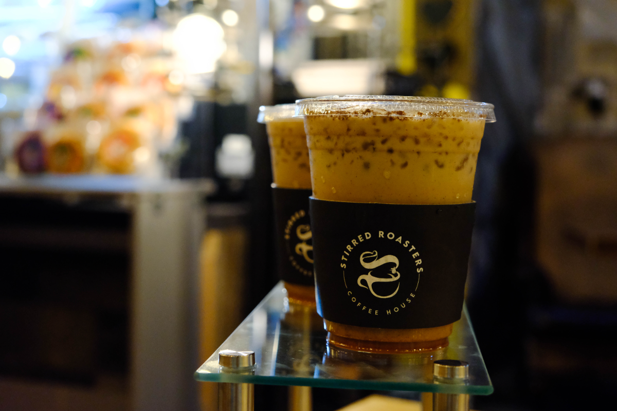
Seal centred on the sleeve, foil gold, 40 mm. Sleeve covers the middle third; the white cup shows above and below.
Cold — clear cup, roast band
Same seal, same size, sitting low so the drink reads through the top two thirds. The drink is the hero; the band is the label.
Rules for every cup
One mark per cup. The seal, once. No repeating pattern, no second monogram on the lid.
Foil or cream, never both. Foil on roast for retail; cream on roast for anything printed digitally.
Nothing else on the band. No address, no handles, no QR. Those live on the card and the door.
Kraft stays unprinted. Bags, napkins and carriers are kraft with a roast stamp at most.
Why the cup matters most
More people see the cup than the shop. It carries the whole identity in one 40 mm circle, so it gets the strictest rules in this guide.
Application12
Brand Guide — page 13 / 17
ApplicationUniform
On the floor
Black on black, one gold mark.
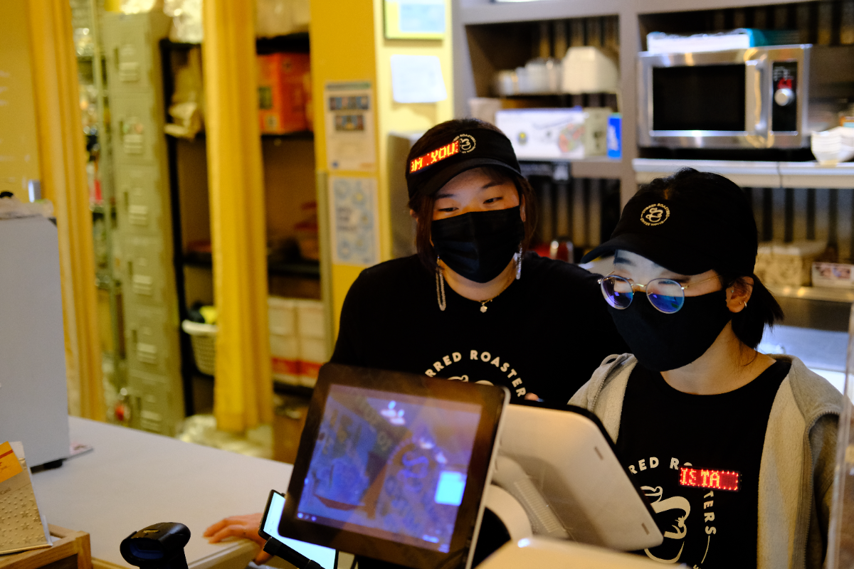
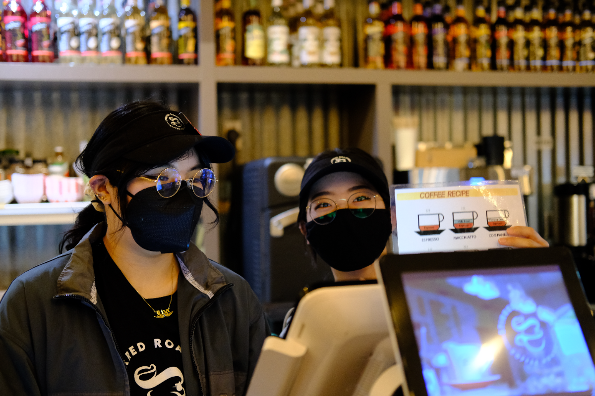
The staff read as one silhouette so the drinks and the boards carry the colour. Every piece is roast black; the only brand element is the mark, printed cream on the tee and embroidered foil on the cap.
Tee
Roast black. Circle seal, cream, 90 mm, centred on the chest.
Cap & visor
Roast black. Seal embroidered in foil gold, 55 mm, front centre.
Name displays
The LED badges are part of the brand's humour, not its typography. Names and roles only.
Never
Gold-on-black print at tee scale — it muddies in the wash. Print cream, embroider foil.
Application13
Brand Guide — page 14 / 17
ApplicationCards & stationery
Business card — 3.5 × 2 in
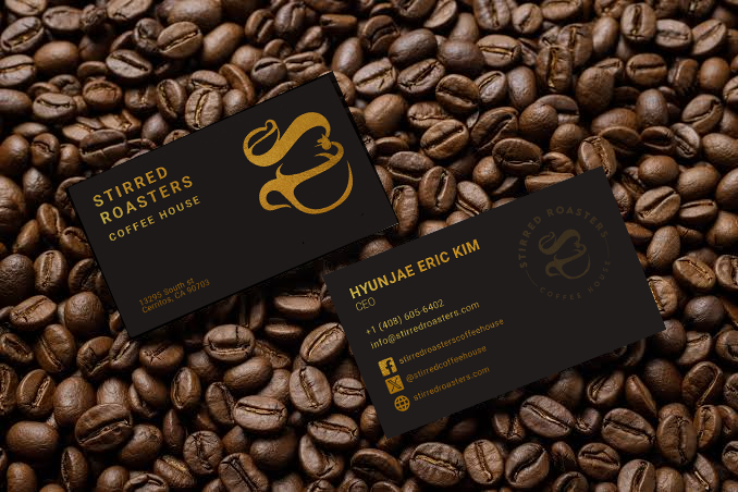
Roast stock, foil gold on both sides. The front carries the stacked wordmark left, the monogram right, and the street address in the lower left. The back carries one person: name, role, phone, email, three handles.
Front leftWordmark stacked, 14 pt / 8 pt, tracking +340 on COFFEE HOUSE
Front rightBare monogram, 26 mm, foil
Address9 pt, foil, two lines, bottom left
Back headName 15 pt semibold foil · role 11 pt light
Back bodyPhone and email 12 pt, then handles with 8 mm foil icon tiles
Back markCircle seal, right, held back to 25% foil — a watermark, not a logo
One card per person
Never print two people on one card, and never leave the role line blank. If a role changes, reprint — the card is foil-stamped, so corrections do not survive a pen.
Application14
Brand Guide — page 15 / 17
PhotographyHow the shop is shot
The look
Warm tungsten, shallow depth, shot at the counter — never a studio sweep. Bokeh from the syrup wall and the string lights is the background of choice. The drink is lit; everything behind it falls off.
Cup at eye level, seal facing camera, square to the lens
Warm highlights, deep shadows, roast-heavy frames
Hands in frame — pouring, passing, holding
Real staff, real shift, real cups
Night exteriors — sign lit, shot square from the lot
Cool or grey-graded coffee shots
Overhead flat-lays on white marble
Stock imagery of beans or latte art we did not pour
A seal turned away from the camera
Crop rule
If the seal is not legible in the crop, it is a texture shot — use it as a background, never as the hero of a post.
Photography15
Brand Guide — page 16 / 17
VoiceHow we write
Tone
Say the drink, say the price, stop talking.
We write the way the counter sounds: short, warm, a little playful, never precious. Menu copy is nouns and numbers. Social copy can have a joke in it. Neither one explains extraction.
Sounds like us
“Funki Monki is back. Small $6.30.”
“Open at six. Yes, really.”
“Twenty-four syrups. Pick two.”
“Open at six. Yes, really.”
“Twenty-four syrups. Pick two.”
Does not
“Experience our artisanal single-origin journey.”
“Elevate your morning ritual.”
“Handcrafted with passion since day one.”
“Elevate your morning ritual.”
“Handcrafted with passion since day one.”
Where the words go
Menu boardDrink name in caps, price only. No descriptions, ever.
Specialty boxName only — the barista explains it. Names may be silly; spelling may not.
Social captionOne line, one fact, one invitation. Under twenty words.
Door & windowHours, address, handles. Nothing aspirational.
Receipt footer“Thanks — see you tomorrow.” Fixed line, do not rewrite.
Spelling is brand
A playful drink name is on-brand. A misspelled category is not. Every board, sticker and post gets read twice before it prints — once for tone, once for spelling.
Voice16
Brand Guide — page 17 / 17
ReferenceThe whole system, one sheet
Colour
Roast #2B2724
Ground, 66%
Signal gold #E9A81C
Accent, max 10%
Foil #C4952F
Print & stitch only
Cream #F4EBDA
Copy on roast
Kraft #B98B5E
Sleeves & bags
Type
Brand — geometric caps, +100 tracking.
Menu headers — brush script, gold, three words max.
Menu items — chalk caps, cream, prices right aligned.
Menu headers — brush script, gold, three words max.
Menu items — chalk caps, cream, prices right aligned.
Mark
Primary — circle seal, foil on roast.
Reverse — seal in cream on roast.
Small — bare monogram under 22 mm.
Sign — monogram + STIRRED, illuminated white, exterior only.
Clear space — one third of the mark's height, all sides.
One per surface — never repeat the mark on the same object.
Reverse — seal in cream on roast.
Small — bare monogram under 22 mm.
Sign — monogram + STIRRED, illuminated white, exterior only.
Clear space — one third of the mark's height, all sides.
One per surface — never repeat the mark on the same object.
Surfaces
Boards — 16:9 roast, script header, two columns, gold prices.
Hot cup — white cup, roast sleeve, 40 mm foil seal.
Cold cup — clear cup, roast band low, same seal.
Uniform — roast black, cream print, foil stitch.
Card — 3.5 × 2 in roast stock, foil both sides, one person.
Hot cup — white cup, roast sleeve, 40 mm foil seal.
Cold cup — clear cup, roast band low, same seal.
Uniform — roast black, cream print, foil stitch.
Card — 3.5 × 2 in roast stock, foil both sides, one person.
Never
Cream or gold type on gold
Gold print at tee scale
Recoloured, stretched or shadowed monogram
Drink names set in script
A fourth typeface for promotions
Stock coffee photography
A misspelled category header
Gold print at tee scale
Recoloured, stretched or shadowed monogram
Drink names set in script
A fourth typeface for promotions
Stock coffee photography
A misspelled category header
Questions
Anything not covered here defaults to whichever option reads faster from the door. If two options read equally well, pick the one with less gold.
13295 South St, Cerritos CA 90703 · stirredroasters.com
Reference17